Designing a new billing experience
Redesigning a complex bill to reduce customer confusion
Role
Experience Designer
Industry
End-to-end CX
Duration
6+ months

Project overview
A redesign of One NZ’s customer bill experience, focused on improving clarity, reducing points of confusion and helping customers understand what changed, what they owe and what to do next.
Problem: Billing confusion was historically a persistent driver of customer complaints, avoidable contact and negative sentiment towards the business. A redesign was overdue and previous attempts had failed or been abandoned.
Business Impact: The bill and accompanying email reaches around 2.4 million customers, making it One NZ’s highest-exposure customer touch-point.
My role: End-to-end UX/UI design, research synthesis, testing, stakeholder alignment and delivery handover.
Outcome: New bill email went live in October 2023, followed by electronic and paper bills in November 2023, with clearer design, hierarchy and improved explainers. Approx. 30% less negative customer queries/feedback.
Why this mattered
The customer bill is often the most widely seen and vital touch-points in the customer experience. For One NZ, it was a key pillar in improving customer confidence and reducing friction. Billing complaints had been a persistent issue for the contact centre and a source of negative customer sentiment, particularly around first bill shock, out of plan spend and part-month charges.
Previous attempts to overhaul the bill had stalled due to backend and delivery constraints. In mid-2023, the bill simplification squad engaged design to help move the project through to completion.

My role
My focus was to help translate existing research, billing knowledge, frontline insight and customer feedback into a clearer bill experience across email, the bill document itself and supporting help content.
Synthesised valuable prior research, complaint themes and stakeholder knowledge.
Facilitated design feedback sessions and workshops with stakeholders.
Engaged frontline retail staff and internal billing specialists to understand recurring pain points.
Worked with Strategy & Insights to understand billing-related complaints and enable post-launch tracking via targeted surveys.
Created and iterated wireframes and visual designs
Ran guerrilla testing with in-store customers and moderated online user testing via Optimal Workshop.
Supported production handover across email, PDF bill and supporting web content, ensuring accuracy and quality.
Approach
Building the evidence base
Because the project had a long history, the first step was to understand what the business already knew. We reviewed prior design research, complaint themes, data, known blockers, technical constraints and previous design attempts. This helped avoid duplicating and gave the team a clearer view of where design could make the biggest impact.
Bringing frontline and customer insight into the design
Billing issues were not only visible in formal complaint data. They were also being handled daily by contact centre and retail teams. We engaged frontline staff and internal billing specialists to pinpoint where customers struggled for comprehension, which explanations were hardest to give, and what information customers needed most urgently.
We tested wireframes with in-store customers and ran moderated online user testing with New Zealanders and Australians across multiple iterations. This helped validate whether customers could understand key concepts such as amount due, changes from the previous bill, extra spend, product groupings and in particular - part-month charges.
Iterating the bill ecosystem, not just the PDF
The project covered more than the PDF bill. We looked across the full bill communication journey: the bill email, the summary page, the detail pages and supporting help content. This allowed us to create a more consistent experience from notification through to explanation and help sections,


Key design decisions
Reframe the bill around customer questions & remove the clutter
We reorganised the summary page around the questions customers were likely to ask first: what do I owe, when is it due, what products or services am I paying for, and why has the amount changed? We also removed all marketing collateral - the bill is not a suitable location for this.
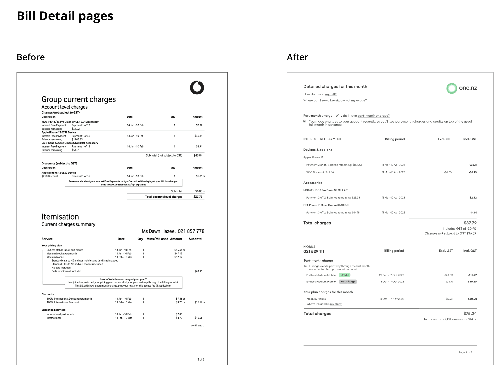
Make part-month charges easier to understand
Part-month charges were a major source of confusion. We tested descriptions, contextual links and date-tag concepts to help customers understand why a charge appeared, and what period it related to. While some date-specific elements were limited by third-party mail house constraints, testing confirmed that clearer descriptions and supporting links still enhanced understanding.
Clarify product relationships
We introduced a clearer parent/child relationship between products, helping customers identify group and companion plans and understand how services related to one another.
Create consistency
We simplified the bill email and aligned tone, wording and iconography across the communication journey. This helped customers build familiarity from the email through to the bill PDF and supporting content.
Add supporting education
We introduced an annotated “How to read your One NZ bill” webpage, accessible from the PDF, to provide explanation without overloading the bill itself.


Impact
Enhanced the billing experience for approx. 2.4m customers, and achieved a complex project that had failed multiple times
Email templates simplified from 2 to 1, reducing communication complexity.
Approx. 30% reduction in negative customer sentiment.
Reduced pressure on frontline and contact-centre teams by making billing information easier to understand.
New email format launched October 2023; electronic and paper PDF bills launched November 2023.
Implemented the tracking of sentiment and feedback around billing for future projects.
Constraints and trade-offs
One of the biggest trade-offs was around part-month charge dates. Testing showed customers responded positively to specific date tags, but external constraints meant we could not include them at launch. Rather than abandon the improvement entirely, we focused on strengthening the surrounding explanation, contextual links and hierarchy so customers still had a clearer path to understanding the charge.
We also learned late in the process that Figma designs needed to be converted into InDesign for production, which created pressure for the Creative team. A key learning was to clarify production-format requirements earlier in future projects of this nature.
Learnings
Human-centred design is critical for high-volume customer communications; each testing round surfaced practical improvements that would have been missed by internal review alone.
Don’t overlook previous research even if a project failed to land, there are often golden ‘nuggets’ of intelligence that stand the test of time and can be leaned upon.
Consistency across the full communications journey matters. Aligning tone, wording, hierarchy and visual cues helped customers recognise and understand billing information across touchpoints.
Production constraints need to be surfaced early. Understanding mail house and file-format limitations sooner would have helped the team make better decisions earlier.
Important to implement a tracking methodology to ensure we measure impact and performance post go-live, and to ensure we revisit and optimise journeys.
Service design · Information architecture · UX/UI design · Customer communications · Support reduction
Other projects

Integrating One Wallet into the eShop
Using AI-enabled prototyping to validate a loyalty proposition in the purchase journey

Prepay Product Refresh
Launching a new Prepay Plus product across app & web with a new design system

Building the One Upgrade mobile add-on
Delivering and increasing One Upgrade adoption through research, UX and experimentation

Redesigning a B2B website for Enterprise and Government
A redesign of One NZ’s business website structure to better serve E&G